National Bank
Sixth largest commercial bank in Canada.
My Role - UX/UI Design / Art Direction.
Project 1:
HOW CAN WE MODERNIZE ADVANCED
SECURITY SEARCH FEATURE?
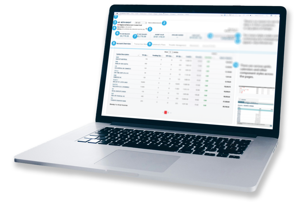
As a UX Designer I led the redesign of the Advanced Security Search feature within NBIN's Compass SaaS platform. The goal was to deliver a seamless and intuitive experience for users accessing stocks and funds.
Less Clicks, More Accurate Results.
PROCESS.
In order to identify key friction points, a user journey was created to highlight issues such as confusing search functionality, dashboard clutter, and overwhelming data presentation. This shared model helped align stakeholders, ensuring a focused approach to improving usability while maintaining system consistency. Conducted thorough research on competitors such as Bloomberg Markets and Globe Investor to understand industry standards and user expectations.
Facilitated collaborative discussions with cross-functional teams, including business analysts, management, and developers in order to define requirements and assess implementation strategies.
Created workflow wireframes and interactive HTML prototypes to visualize design concepts, test usability, and gather feedback from stakeholders.
Impact.
Increased usability of the Advanced Security Search, resulting in a more efficient and satisfying user experience, leading to increased retention and revenue opportunities.
Improved user engagement metrics, with increased search interactions and a significant decrease in search abandonment rates.
Reflections.
Designing an intuitive experience for complex financial data was a rewarding challenge. Collaborating closely with cross-functional teams, including developers, highlighted the importance of aligning design goals with technical constraints. Although updates required considerable effort and consistency with existing components, this experience reinforced my commitment to teamwork and maintaining design standards.
Project 2:
Improving Compass SaaS Design System
A UX audit and design system enhancements based on industry best practices and usability heuristics.
My Role: UX Designer
Guiding Principles: Used Nielsen Norman Group’s 10 Usability Heuristics as a framework to evaluate and improve Compass's user experience.
Objective: Conducted a UI/UX audit to identify inconsistencies and usability issues. Collaborated with stakeholders to implement actionable design improvements.
Process:
Conducted a detailed UI/UX audit across multiple modules, identifying inconsistencies and usability pain points in a large-scale financial SaaS platform used for uploading, searching, and analyzing complex financial instruments and data.
Collaborated with stakeholders, including developers and business analysts.
Designed and documented a roadmap for a scalable, standardized design system.
Key Findings & Solutions
✔ Inconsistent Standards & Navigation
Issue: Varied design patterns and naming conventions made navigation confusing.
Solution: Unified design system to standardize components, terminology, and layouts.
✔ Unclear Error Messages & Icons
Issue: Vague system messages and unlabeled icons led to confusion.
Solution: Clear, action-oriented error messages and tooltips for complex icons.
✔ Design & Layout Inefficiencies
Issue: Cluttered screens, inconsistent typographic hierarchies, and overuse of modals.
Solution: Optimized layouts for readability and progressive disclosure to streamline user flows.
Impact.
Improved usability and task efficiency with clearer navigation and UI standards.
Decreased search abandonment rates by improving labeling and findability.
Strengthened design system for long-term scalability.
Reflections.
By applying usability heuristics, we created a scalable, user-friendly experience that enhances efficiency and engagement.
Visual Design at NBIN
NBIN Annual Conference Campaign
Led the design and art direction for two comprehensive campaigns, ensuring consistent branding and seamless integration of visual elements across various platforms, media and PPT presentations.
60-Foot Immersive Event Displays
Designed a series of 60-ft wide immersive displays using interchangeable graphic templates, curated photography, and bold typography. The visuals emphasized key informational points and speaker bios, reinforcing NBIN’s brand identity and values while creating a visually cohesive and dynamic experience.
NBIN's Annual Conference goal is to bring finance community to network with NBIN's top executives, world class thought leaders and fin tech peers.
As the lead designer for NBIN's "Stronger Together" and "All In" Annual Conferences, I created cohesive branding and immersive visual experiences that defined the visual identity.


